Blog Layout
This is why visual marketing is so important
Our eyes are powerful. Sight is one of the five senses, as we all know, but it may just be the one with the most strength. We hear the clichés all the time, that a picture is worth a thousand words, or that we eat with our eyes first. They are just sayings, indeed, but there is hard-based fact behind them.
A November 2012 issue of “Physiology & Behavior” studied that last cliché, and what it found was quite interesting. The results of the study were that “visual stimuli have been shown to alter the perception of taste, smell, and flavor.” So food that looks pleasing to the eye can actually alter the smell and flavor of that food in our minds.
It’s quite fascinating, but what does it have to do with retail and marketing? The answer, quite simply, is everything. The saying “we eat with our eyes first” can easily be said another way: We consume with our eyes first. What we consume, as potential purchasers of a product, is information.
Does this product look good to me as a potential buyer? Is the way in which it is packaged, presented and displayed attractive to me as a potential buyer? These are the questions our brains process at rapid-fire pace when we see a product for sale.
Most items we buy are purchased based on what they look like. Do we read every word on the box of the blender we see in the department store before making our choice? Or do we look at the display item and think it looks nice? More times than not, it’s the latter. That’s why retailers put out display items in the first place. You can’t take a test drive of a blender like you can a car, so your eyes need to like what they see before they’ll convince your brain that this one blender is better than the others.
Visual marketing is an essential part of selling goods for retailers. Studies have shown that humans process images 60,000 times faster than words, and the brain retains 80 percent of the images it sees versus only 20 percent of what it reads.
So maybe, then, a picture is actually worth 60,000 words.
Researchers have studied the effects of visual stimuli for years, and all the results point to the same conclusion, that “we eat with our eyes first.” Here are just a few of those statistics:
• Only 10 percent of information that is told to a person will be retained three days later. If an image is paired with that information, though, the retention rate jumps all the way to 65 percent.
• A third of all marketers say that visual images rank first when it comes to the most important form of content for their business.
• Social media marketing follows the same trend, too, with 80 percent of marketers using images and other visuals in their marketing on that platform.
Visual stimuli can come in all sorts, shapes, sizes, colors and designs. While no one can know for certain what specific style and design will appeal to each and every person on the planet, we do know the general outline of what will make a good visual. That study about how we eat with our eyes first laid it out quite nicely:
“Color may be the most obvious visual cue, but expectations through learned associates are set by other visual cues as well, including gloss, evenness, and shape,” it reads.
This is why visual marketing that stands out to you – whether that marketing is on TV, in a print advertisement, online or in person – is clean cut and bold yet not overpowering. Good marketers know what the research has found, and they’re catering their content to the findings.
This isn’t a new concept, either. The idea of “window shopping” has been around for decades. People stroll through city streets, oohing and aahing at window displays that stores use for promoting their beautiful products. Clothes hang draped perfectly over the mannequin, with the mannequin portrayed almost in a specific situation. This visual stimulus is meant to place the shopper in a situation that he or she can envision, with that hat, that shirt, those pants or that scarf as the perfect item to be wearing.
Or think about shopping for furniture. When you walk into a store to purchase a couch, do you go to the couch section where all the couches are lined up end to end? No, you don’t, because that doesn’t exist. Instead, the store has all its furniture laid out in mock rooms to show you how the furniture would look in your living room, your dining room, your den, your patio, etc.
How a product is displayed is directly correlated to how well it sells. A study.com story points out that, “humans are, by nature, visual creatures and we are drawn to things that look pretty, organized, and appealing.”
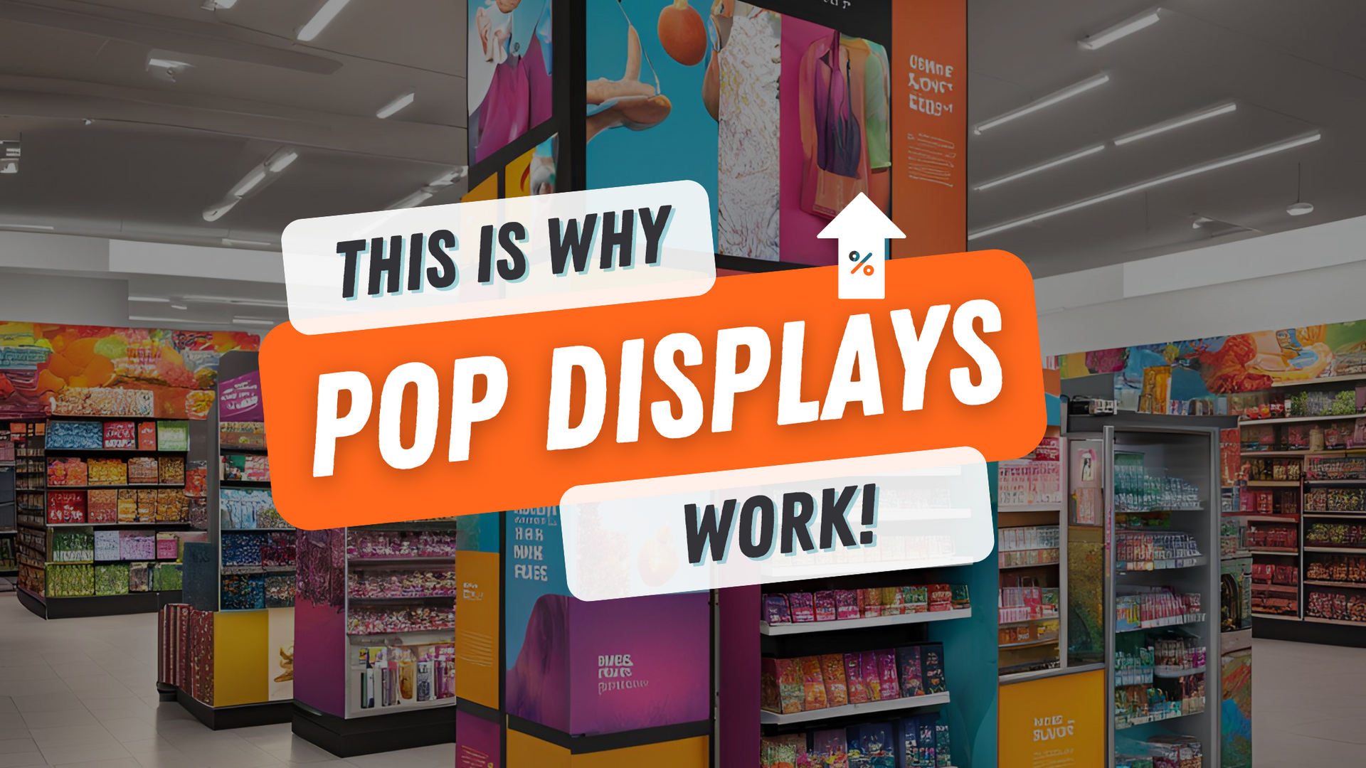
This concept doesn’t just go for entire stores, though. It applies quite succinctly to different products in the same store. At big box stores throughout the world, which products stand out from the others? Think about it – it’s the products that are displayed on end caps or have their own point-of-purchase display that presents the product in a clean and visually-pleasing way.
There are specific reasons behind every decision that is made in a store about where products are located and how they are displayed. And each of those decisions caters to what the shoppers want. Shoppers want product displays that are pleasing to the eye, and stores want these products, too, as they are the products that sell more.
By 7064666794
•
August 7, 2024
Rhino Global Solutions on The Power of Well-Designed Displays August 5, 2024 In the competitive world of retail, the battle for consumer attention is fierce. Manufacturers are constantly seeking innovative ways to stand out and capture the interest of shoppers. One of the most effective strategies is through the use of well-designed, attention-grabbing displays. These displays not only enhance the aesthetic appeal of a store but also play a crucial role in driving sales and securing retail partnerships. Gaining Entry into More Retail Stores For manufacturers, creating eye-catching displays is essential to gaining entry into more retail stores. Many retailers will not even consider stocking a new product unless there is a compelling display to support it. According to a study by Point of Purchase Advertising International (POPAI), 82% of purchasing decisions are made in-store. By investing in creatively designed, well-lit, and strategically placed displays, manufacturers can captivate shoppers and make their products more attractive to retailers. Studies have shown that consumers are more likely to buy products from displays that catch their eye. A Nielsen study found that displays can increase product sales by up to 62%. These displays can highlight new arrivals, seasonal items, or special promotions, making it easier for customers to discover products they might not have noticed otherwise. In essence, a well-executed display acts as a silent salesperson, enticing shoppers and guiding their purchasing decisions. Benefits: Securing Larger Initial Orders One significant advantage for manufacturers investing in point-of-purchase (POP) displays is the ability to secure larger initial orders from retailers. Recognizing the potential of a well-designed display to boost sales, retailers are more likely to agree to substantial initial orders to stock these displays. Manufacturers can leverage this opportunity by dictating the order amount, ensuring their products are prominently featured in the store. This arrangement benefits both parties: retailers get an effective tool to drive sales, and manufacturers achieve higher initial sales volumes. According to the Harvard Business Review, properly designed displays can boost sales by up to 20%. This mutually beneficial relationship underscores the importance of collaboration in creating impactful displays. Capturing Customer Attention and Driving Purchases The ultimate goal of any retail display is to attract customers and drive purchases. An eye-catching display serves as a magnet, drawing customers into a specific area of the store. Once engaged, the chances of purchasing the showcased products increase significantly. Consider a vibrant, well-organized display of new products. The attractive arrangement, combined with informative signage and appealing packaging, captures the customer's interest. They stop, explore the products, read the labels, and ultimately decide to make a purchase. Without the display, these products might have gone unnoticed on a regular shelf. Moreover, well-designed displays can create a sense of urgency. Limited-time offers, seasonal themes, or exclusive collections showcased in a display can encourage immediate purchases, fearing they might miss out on a good deal. This urgency further drives sales and helps retailers meet their revenue targets. A study by the Journal of Marketing found that creating a sense of urgency can increase sales by up to 35%. Conclusion For manufacturers, well-designed, attention-grabbing displays are a powerful tool in the retail arsenal. They not only boost sales by capturing customer interest but also enable manufacturers to secure larger initial orders and expand their retail presence. By investing in innovative and creative display solutions, manufacturers can enhance the shopping experience, drive impulse purchases, and ultimately achieve greater success in a competitive market. The synergy between eye-catching displays and effective product presentation is a win-win for both retailers and manufacturers, underscoring the vital role of visual merchandising in the retail industry.

By 7064666794
•
October 11, 2023
October 11, 2023 A chance meeting between Jerry Smith of Rhino Global Solutions and executives at Carnivore Meat Company led to the company generating new sales and landing additional retailers for their Vital Essentials Raw Bar line of dog snacks. Thanks to the collaborative work put in by Rhino and Carnivore to re-imagine and completely re-design its POP displays, the Raw Bar line of products has become a dominant force for the company and set a new standard of expectation for the industry. According to Nick Ebert, Chief Commercial Offer at Carnivore Meat Company, the Vital Essentials Raw Bar line of products is a key differentiator in their overall product offering and sets Carnivore apart from the industry and what quality looks like in treats and snacks for pet. How It All Began The Rhino team stumbled upon Carnivore Meat Company at a trade show and saw the first-generation free-standing display rack it had at its booth. Taking a quick look at it, they pointed out some design improvements that could be made, which were opportunities Carnivore had internally identified as needing to be fixed. Since the Rhino team is quite "tenacious" as Nick pointed out, they kept coming back to take measurements and look at different angles of the company's current display. "They really went way over and above, in terms of trying to get a real sense of the use of the product and the function design of the POP display, understanding what type of square footage we have to work with in a retailing space," he said. That display rack at the trade show worked in terms of design, but had some stability opportunities. It also didn't rotate as well as Carnivore wanted it to, which served as a deterrent for customers in stores. Time to Get to Work Within three weeks of the trade show, Rhino came back to Carnivore with design recommendations and even had schematics drawn up. They took it to the next level, Nick said, making a prototype from the design and then getting it into final production. He was especially impressed with the team Rhino Global Solutions works with in China for its materials. "The group Rhino works with in China is just awesome," he said. "They take a look at every angle, and take every measurement so you know what you're really working with." Carnivore ultimately chose to switch their POP display to Rhino's design, and they're currently on the third iteration of the display. The Results Nick and the team at Carnivore are extremely pleased with the results of the POP display Rhino created for them. "I've been at trade shows where we have customers who have come up to us and tell us it's the most functional and profitable display they've put in their store,” he said. Stores that had Carnivore's first-generation display and saw Rhino's version were so impressed that they decided to keep both. Today, the Vital Essentials Raw Bar display is so popular that Carnivore uses it as a selling point for new retailers. Nick points out that across the company's entire database of retailers, about 50% to 60% have the in store today and most have transitioned to the design that Rhino created. Every month, the company is placing about 30% of all new net stores with Vital Essentials Raw Bar racks, which equates to about 30 to 50 new accounts per month. Beyond just the new retailers they are bringing on board, the current Vital Essentials Raw Bar racks also carry more products. The basket sizes were increased in the latest iterations of the POP display, allowing Carnivore to almost double the holding capacity of the display. Why the Rhino Raw Bar Racks Work Nick says there are many reasons why the Vital Essentials Raw Bar racks that Rhino designed for them work. One of the top factors is the space they take up. The latest version only takes up about 20 square inches. This means retailers don't have to dedicate significant linear space for the rack, which is a problem they were running into with earlier versions. In addition, the compact design also allows the Raw Bar rack to be placed anywhere in the store -- from the end of a checkout counter, to the center of an aisle, to an open space in front of the store. That's a huge advantage not only for Carnivore in terms of getting into new retailers but also in selling more products once the rack is placed. The 360 design of the Raw Bar rack wasn't unique in terms of retail POP displays, but it was for pet retail, Nick added. It also created a sensory experience for pets who came into stores with their owners. Because of the lower level of the Vital Essentials Raw Bar rack, a lot of larger dogs can sniff the products out right away. Many pet owners have told Carnivore that their dogs go right to that lower level. And once the owner sees how interested the pet is in the product, "they're more apt to pick it up, put it in the car, take it home and try it," Nick said. Why Working with Rhino Was a Great Fit for Carnivore The Rhino team certainly doesn't rest on their laurels. They constantly check in with the team at Carnivore to make sure everything's going well. They've been good advocates in making sure Carnivore understands the price side of things, helping to navigate them through some of the logistics of it. Nick adds that the Rhino team is also very transparent with them, making sure there are no hidden fees or surprises along the way. "What we haven't seen, what you see with a lot of vendors, is Rhino doesn't just come back for the PO," he said. "More than anything else, it's the follow-through that we have with our account executive that's been consistent." The Rhino team is always working to fix any problems that Carnivore might have with a specific POP display, its delivery or design, and they're always enthusiastic about generating new ideas. This speaks to the integrity of Rhino Global Solutions, Nick says, since they work hard to make things right. What the Future Holds for Carnivore The Vital Essentials Raw Bar POP displays truly helped define rapid growth for Carnivore Meat Company, Nick said. Now, the company is using the racks to get full linear placements in stores. As for future plans, the company is always looking for new and different products to put in the Raw Bar, looking at higher-end items and looking to integrate them into packaged items for sale at independent pet retail stores. It's important, Nick said, for the team to always be innovating. "The longer you stay in the slow lane or neutral, the faster people pass you," he said. "That's not really part of our corporate culture at Carnivore.” To learn more about Carnivore Meat Company, visit carnivoremeat.com.

By Jerry Smith
•
April 19, 2023
April 18, 2023 You’ve spent time and resources developing a great product. The challenge is attracting attention to it so consumers will purchase it and then spread the word to others. Strategies such as Point-of-Purchase (POP) displays are commonly acknowledged to be the best use of your marketing dollars. In days gone by, deploying these strategies was simple. You’d work with a local company to create a display, launch it and start seeing increased sales. Things are quite a bit different today. Now, companies have nearly limitless options for deploying new marketing solutions, both from direct manufacturers and from brokers that offer a more hands-off, end-to-end production experience. But, which method offers the best path to product delivery? Both options have their advantages, though for the purposes of today’s assessment, we’ll be focusing on two product delivery aspects in particular -- quality control and production efficiency. Can You Establish and Maintain Quality Control? Quality counts! One of the best parts about working with brokers is they are ultra-focused on delivering quality. This is especially true of brokers that both design and produce solutions. These businesses maintain trusted networks of supply chain partners across original equipment manufacturers (OEMs), distributors and other vendors who have been tested and vetted by the broker company. For the broker, this means full oversight over the final product while being able to benefit from each partner’s uniquely-optimized workflows. From production to transportation to quality control, everyone has a job to do, and they do it well. Manufacturers offer a comparable service for product delivery but with several key drawbacks. Although manufacturers retain control of processes by keeping things in-house, their lack of diversity in processes can actually limit the quality of the final product. For example, the type of materials they offer might be limited, forcing buyers to adhere to different standards than they anticipated. Or their shipping and distribution processes may be unoptimized and at a higher cost than they would be through a dedicated transportation provider. From one perspective, their services make them jacks of all trades -- and masters of none. From another perspective, they're simply a jack of one trade -- the one they specialize in. But, does this approach really give buyers the best possible outcome? Consider the alternative of working with a broker. Brokers select the ideal partner for every stage of product delivery. In essence, they're able to help their clients become masters of all stages, as they're able to leverage their network of specialists to connect clients with the vendor best suited to help, guaranteeing a higher level of quality across all processes. This includes: Analyzing the results of quality tests Identifying areas for improvement Making changes to the production process or product design as necessary The COVID-19 pandemic forced companies to redefine core business processes that support new methods of service delivery. According to research from the Institute of Supply Management, demand for brokered materials will continue to increase. As companies become leaner, the services of a broker become even more valuable. Buyers should always strive to make and maintain connections with trusted brokers to ensure that their processes are in good hands.

By Jerry Smith
•
September 2, 2020
Businesses play a big role in global warming. It's why many have initiated carbon reduction programs in recent years. Companies can reduce their carbon footprint through the materials they use, how they manufacture materials, by choosing office space in energy-efficient buildings and a number of different ways. Unfortunately, there are some parts of business that can't achieve zero emissions. For example, there are no electric options for airplanes or cargo ships -- two of the main modes by which goods are shipped internationally. International logistics -- which includes transporting goods across borders -- can account for up to 50% of a company's total carbo footprint. What's more, international freight transport is expected to quadruple by 2050, which could result in a 290% increase in carbon dioxide emissions. This does not mean that all hope is lost, though. Through innovative partnerships called carbon offset programs, businesses can do their part and be a good corporate citizen. At Rhino Global Solutions, we want to do our part to reduce our carbon footprint and help reduce global greenhouse gases. That's why we have joined a new carbon offset program that's provided by our shipping company, Flexport. What are Carbon Offsets? In simple terms, a carbon offset program takes money from one source and uses it to fund projects that are proven to reduce carbon dioxide emissions. In the case of international shipping, this means taking money from people and companies who rely on international shipping and funneling it to programs to help offset the carbon footprint created by that shipping. In physical terms, a carbon offset is a certificate that represents the reduction of one metric ton of carbon dioxide emissions, or 2,205 pounds. Developers then sell these carbon offsets they create to fund projects so they can reduce emissions even further. There are literally hundreds of examples of different carbon offset programs. The reason the programs were created is many of the emission reduction projects can be quite expensive and difficult for smaller business owners to do on their own. Let's take a look at an example: Animals at dairy farms release methane gases, which are damaging to the atmosphere. There are machines, though, that can capture and destroy that gas before it can do damage to the Earth. While these are outstanding projects that can have a great positive effect on the environment, they are very expensive to install and maintain. One way the dairy farmer can fund the project is by selling carbon offsets. He can present his proposed project to a non-profit or environmental group and show the amount of methane gas he would reduce. Those groups would then help him sell the offsets, and use the money he receives in return to purchase and install the machine into his operations. In this way, other people can help the dairy farmer eliminate the methane gas by purchasing his carbon offsets. How are Carbon Offsets Generated? Terrapass does a great job of explaining the ways in which carbon offsets are generated. The organization launched in 2004 to help everyday people reduce the climate impact of their driving. As the organization progressed over the years, it expanded and has helped more than 1,000 businesses and institutions take responsibility for their impact on the climate. The three ways carbon offsets can be generated, according to Terrapass, are: By capturing and destroying a greenhouse gas that would otherwise be emitted into the atmosphere. The dairy farmer above is an example, as are similar programs to capture methane gas at landfills. By producing energy using a clean, renewable resource that eliminates the need to produce that same energy from fossil fuels. Wind, solar and hydro power are all examples of this. By capturing and storing greenhouse gases to prevent their release into the atmosphere. Projects that promote the growth and maintenance of forests are examples of this. How We are Working with Flexport on Carbon Offsets Rhino Global Solutions is always looking for ways to be a better corporate citizen. We are very cognizant of climate change and the alarming effects of global warming. Like many other companies, though, because we rely on shipping to deliver materials to our customers, we contribute indirectly to increased carbon production. That's why we are very excited to partner with our shipping company Flexport to participate in their carbon offset program. Members in Flexport's program can offset up to 100% of their carbon emissions. This is done through a partnership with Flexport.org, the company's social impact organization. Flexport also partners with Carbonfund.org, which directs donations to certified carbon offset projects. All of Flexport's LCL shipping services have been 100% carbon neutral since June 2018, and we are excited to now be a part of this.
By Jerry Smith
•
July 24, 2020
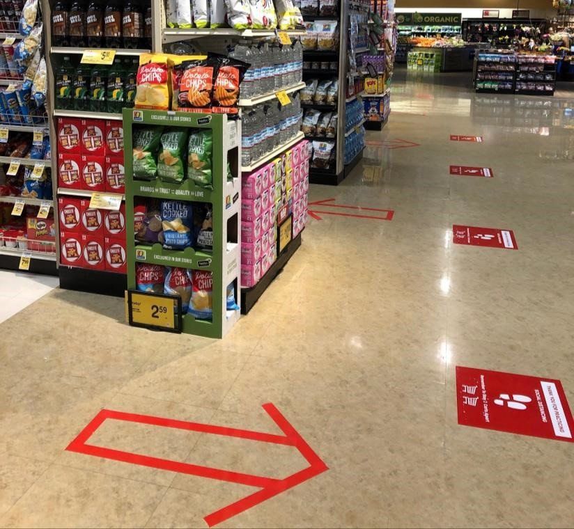
The COVID-19 pandemic will change retail forever as the result of changing habits, desires and worries among shoppers. When states imposed lockdown orders to slow the spread of the virus, there was a significant uptick in e-commerce spending. Consumers were forced to shop online for more products than they did in the past, but they will return to retail stores eventually, once they're allowed to. This is especially true among millennials who "demand the in-store experience," according to Daniel Binder, one of the partners at Columbus Consulting. Binder, who helped manage supply chains in Asia during other pandemics such as SARS and H1N1, recently spoke to Retail Dive about millennials, saying: “They want the experience to be embracing, and the brand's responsibility is to build a level of trust, and the store experience helps anchor that." While retailers will have to make major changes to survive in the post-pandemic world, so, too, will manufacturers and brands that sell products in brick-and-mortar stores. Here are some ways brands will have to adapt their in-store merchandise displays. Hands Off! As Binder told Retail Dive: "Right now, there's fear as customers move through a store. What retailers will have to figure out is how to bring a sense of structure and calm." This fear is already driving consumer decisions when it comes to paying for goods. According to recent studies , consumers will likely prioritize touch-free technology over factors such as rewards from their credit cards in the future. What's more, 55% of U.S. consumers worry about paying with cash. These trends are forcing retailers everywhere to adopt more contactless payment options for people when they check out. This fear of touching something someone else did could have a dramatic effect on how consumers interact with product displays in other retail sectors. The problem for manufacturers, of course, is that the more customers interact with your display , the more likely they are to purchase your product. Manufacturers can adjust by quelling consumers' fear. But how? One way is to integrate motion activated monitors into your retail display. These devices sense when a customer has approached your display, and start playing a video that tells the story or your product, brand or company. You can also use motion sensors in conjunction with lighting to illuminate aspects of your product and/or display that you want consumers to focus on. Motion-sensing technology enables you to create an interactive display without requiring people to touch anything. In addition, a well done video provides the company the ability to disseminate the sales message to customers in the manner they choose. This consistency enables the display to be your best sales person. If the product you sell requires physical interaction -- such as sheets or pillows -- you need to create an environment that is safe and clean, and engenders confi-dence in the consumer. The coronavirus has been proven to live up to 72 hours on materials and surfaces if not treated properly. And while disinfecting is essen-tial, it also takes a lot of time and manpower. That's why it'll be important to integrate some form of automatic disinfectant to your retail display. UV light can be used to blast bacteria and viruses off clothes, bags and other products that shoppers like to touch before they buy. Make it Great! Merchandising has always been vital, but it's going to take on an entirely new level of importance in the future. The coronavirus pandemic hasn't only influenced more people to shop online. It's also affecting how people are shopping in stores when they venture out. There are likely to be fewer overall customers in a store at one time -- either because of a lack of demand or because of a state-imposed limit on capacity. In addition, when customers do shop in store, they're likely to spend less time browsing, focusing instead on getting what they need and getting out. This makes merchandising even more important today. Put plainly, if you're going to take the time to create a merchandise display, you better MAKE IT GREAT! You have a very limited amount of time to tell your story as customers walk about a store. Your retail display, then, needs to capture their attention quickly, draw them in and make them want to interact with that. How do you do that? By following the basic principles of merchandising. Your retail display needs a great header to draw people in. What is your product and what does it do? Are you taking advantage of brand recognition? Etc. You also need to pay attention to the shape of your display, opting for rounded edges that are much more welcoming than rigid shapes such as squares. Usually, shapes will grab a consumer’s attention. Choose colors that match your brand but that are pleasing and soothing to the eye. And don't forget to integrate subtle lighting that highlights your product and doesn't distract from it. You've got to tell your story effectively nowadays. And with retail displays, that means being even more aware of the elements of visual marketing than in the past. Get Smaller Retailers have always aimed to maximize every square inch of their floorspace. They devised the perfect travel patterns for shoppers to navigate their stores, integrating merchandise displays and end caps that caught their attention but didn't stand in the way of the free flow of shoppers. But COVID-19 has dramatically altered the in-store shopping experience. From spit guards set up at registers to separate customers from workers, to clearly marked social distancing boxes on floors, to one-way directional travel in aisles, the name of the game today is "space." The concept of social distancing is built around that word. People are suggested to stay at least six feet away from people who don't live in their households. When indoors at retail stores, agencies such as the CDC have consistently urged people to keep their distance and wear masks. People want to protect their personal space, and there are two ways retailers can help them do that -- by limiting the number of customers in the store at one time, and by opening up floor space so it's easier to create separation. This is forcing manufacturers to be even more cognizant of the size of their retail displays. While the size of retail displays has always mattered, it'll be even more important in the coronavirus world. The less floor space your retail display takes up, the more stores it can fit in -- and the more spots in the store it can be placed. Retailers are going to be very sensi-tive to size as they look to appease their shoppers. The more you can do to help them in that cause, the more likely your display is to get accepted. Manufacturers will soon be faced with a new world when marketing their products on retail displays, if they haven't already. Understanding that change is here, and effectively responding quickly to that change, will be the key to survival.
MENU
Monday
Tuesday
Wednesday
Thursday
Friday
Saturday
Sunday
This is a placeholder for the Yext Knolwedge Tags. This message will not appear on the live site, but only within the editor. The Yext Knowledge Tags are successfully installed and will be added to the website.
Privacy Policy
| Do Not Share My Information
| Conditions of Use
| Notice and Take Down Policy
| Website Accessibility Policy
© 2025
The content on this website is owned by us and our licensors. Do not copy any content (including images) without our consent.

